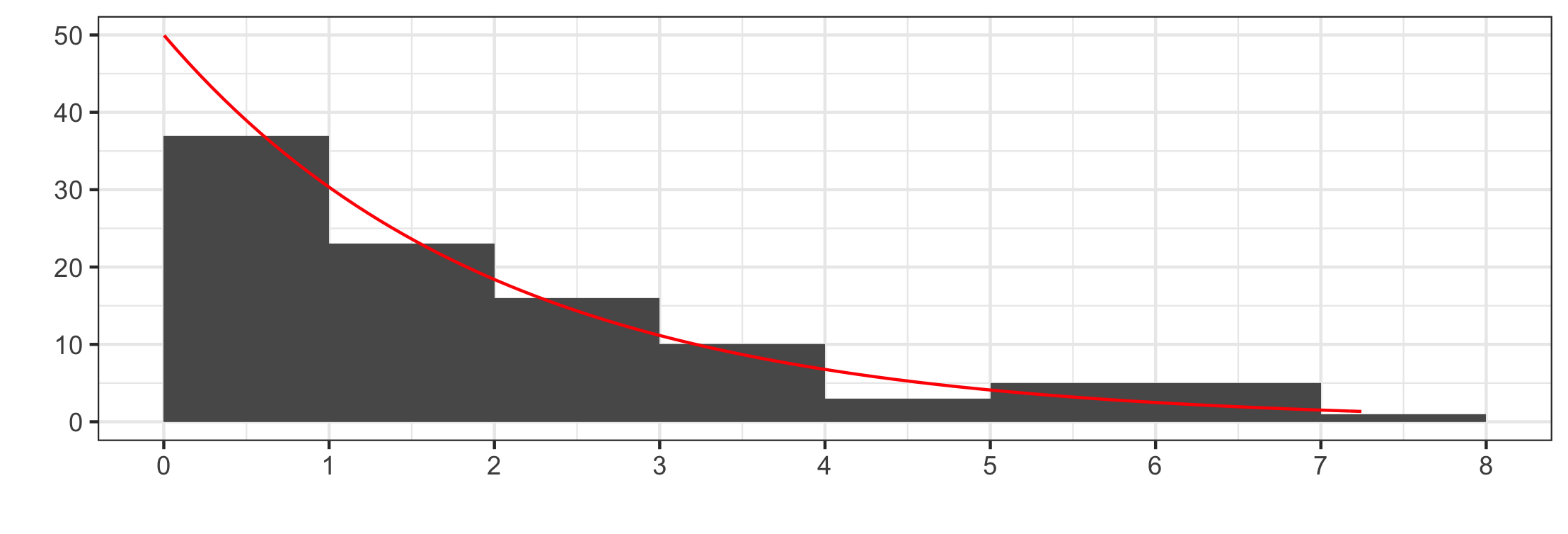
Comparing distributions
Background
I'm involved in a 12 week, randomized control trial determining the effectiveness of phone coaching on low-income diabetics. One of our physician-advisors had difficulty understanding the following figure which visualizes the range or our outcome variables.
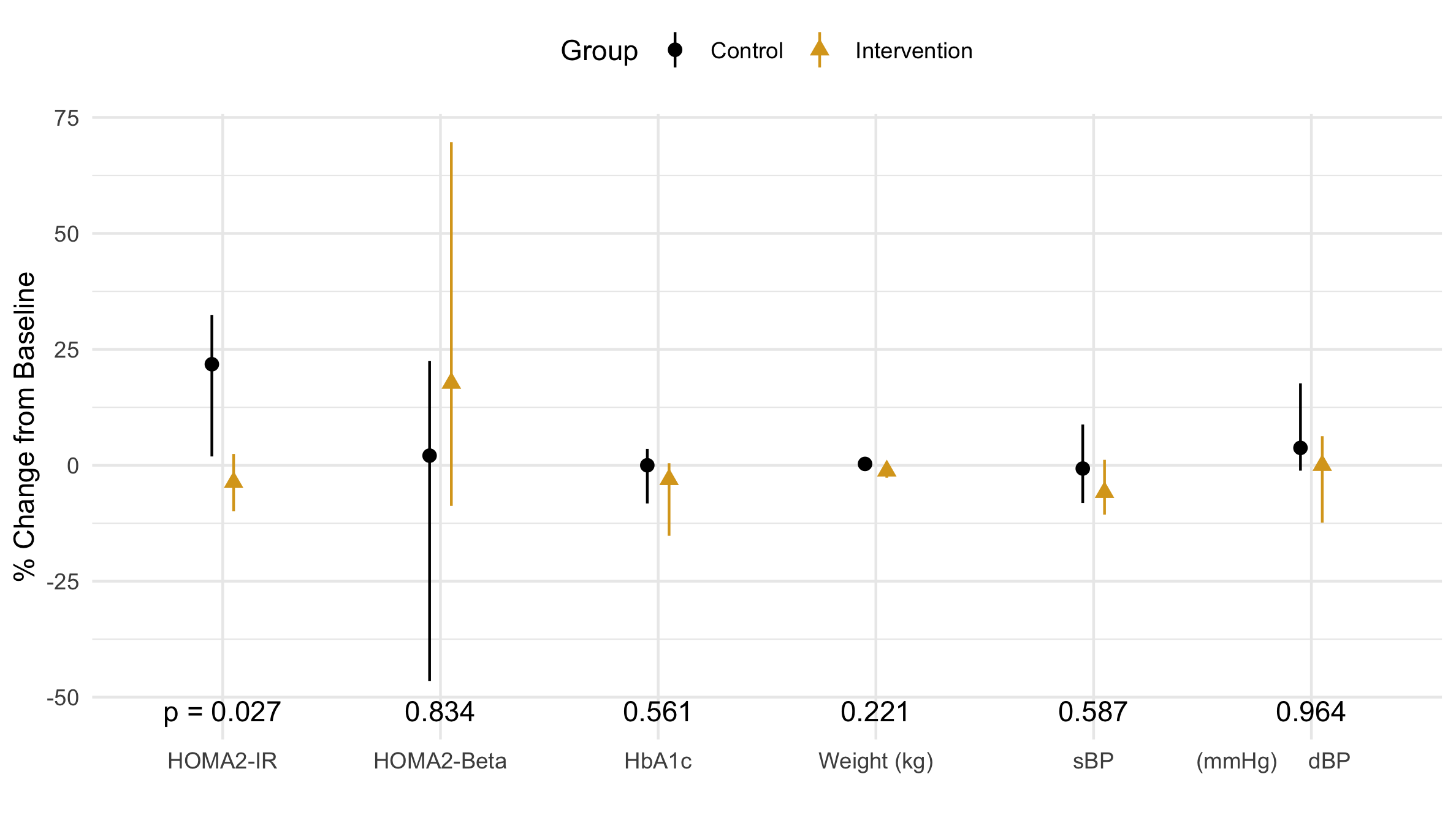
Figure 1 The median of the percent change (from baseline) of the outcome variables is marked by a point while the first and third quartiles are visualized by verticle lines.
Our published physician wrote the following upon reviewing our manuscript:
Physician's Critique
[I've] never seen quartiles shown as lines on such a graph before... what is the utility? many or most readers will be confused. Why show 1st & 3rd quartiles instead of 1st & 4th? The p-values do not seem to correspond to the data shown, but it is not clear to me whether the error bars are the range for the quartiles or not, and what the mean or median for each quartile shown is.
While I think this figure is clear, the customer is always right. My job is to communicate these distributions our audience (physicians) as clearly as possible.
The following tour showcases different visualization options to understand the pros and cons of comparing the range of several continuous variables between groups.
Q0 |
zeroth quartile |
0th percentile (aka minimum value) |
Q1 |
first quartile |
25th percentile |
Q2 |
second quartile |
50th percentile (aka median) |
Q3 |
third quartile |
75th percentile |
Q4 |
fourth quartile |
100th percentile (aka maximum value) |
IQR |
Interquartile range |
IQR = Q3 - Q1 |
The tour
Our primary outcome, ΔHOMA-IR, is a slightly asymmetrical distribution with outliers. The outliers come from patients with advanced-stage diabetes who are in various stages of organ failure. Unless explicitly stated otherwise, our discussion below will refering to the primary outcome: ΔHOMA-IR.
Interquartile Range
Robust statistics (the median and interquartile range) describe the inner half of the distribution; the exclusion of the outliers is acceptable because we are interested in how normal (not advanced-stage) diabetics are affected. Notice the distributions' small dispersion; it is easy to see they are different. We also see a left-skew in the control group.
It is unfortunate that this set of outcome variables have such a wide range of dispersions, for it is difficult to see the narrow range of the weight distribution.
Raw data and outliers
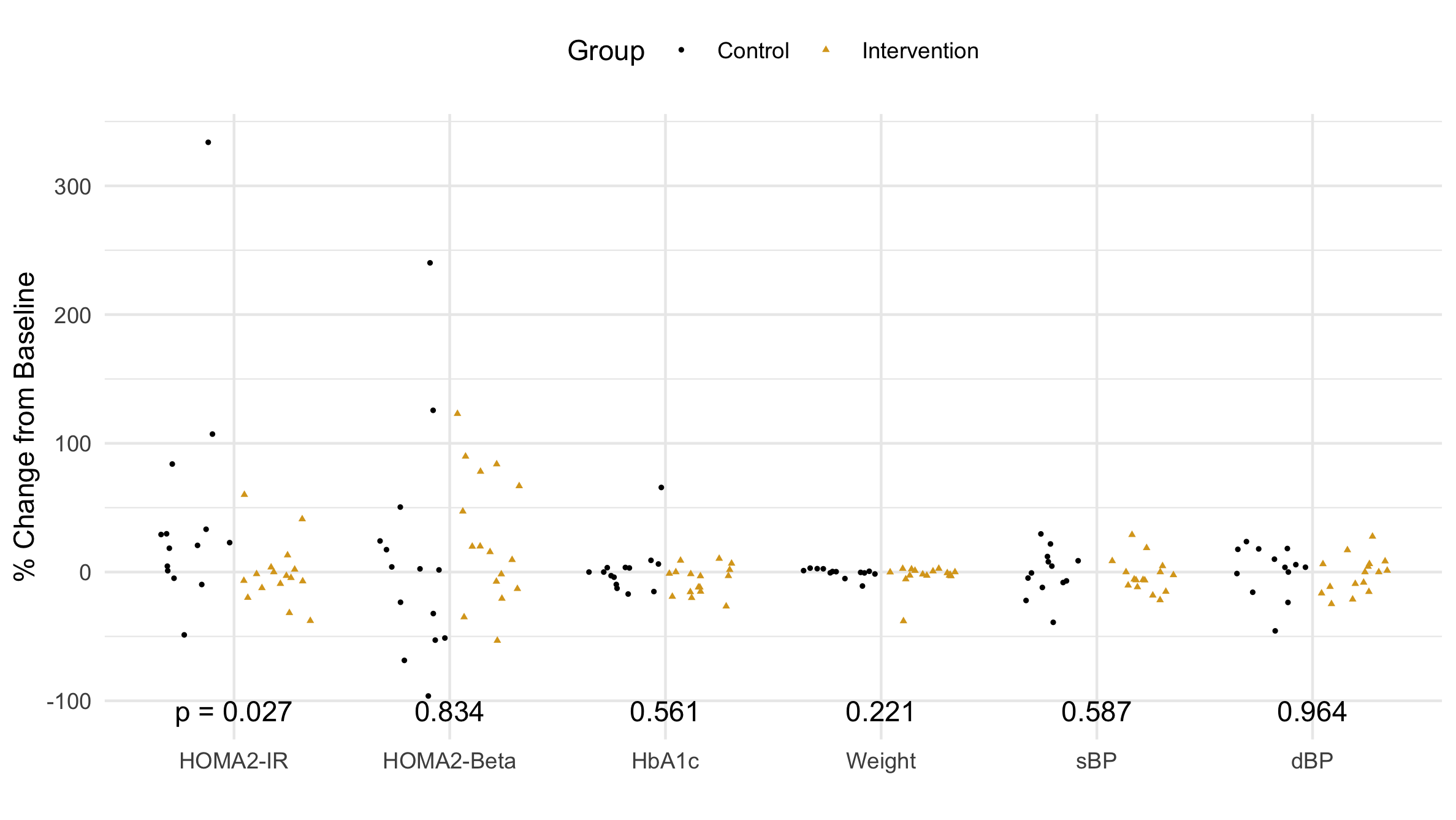
Figure 2 A comparison of the outcome data between the control and intervention groups.
When choosing a visualization, there is no substitute for looking at the individual data points. First, I notice the outliers (see Table 2). They will inflate the standard deviation and potentially skew (add asymmetry to) the distribution. Next, I see that the intervention group is clustered by zero, while the control group is more spread out. These distributions look a little different. The secondary outcome variables look the same; that is, they look like side-by-side clouds with more or less the same center and width.
ID |
Variable |
Percent |
Diff |
Final |
Initial |
|---|---|---|---|---|---|
22 |
HOMA-IR |
+340% |
+2.27 |
2.95 |
0.68 |
25 |
HOMA-Beta |
+240% |
+78 |
111 |
33 |
33 |
HbA1c |
-66% |
+4.6 |
7.0 |
11.6 |
97 |
Weight |
-37% |
-43 kg |
70 kg |
117 kg |
7 |
Weight |
-11% |
-14 |
113 |
127 |
While looking at the raw data is a great way to compare the two distributions, p-values answer the question of statistical significance. At the study's outset the researcher determines the level of significance (usually 0.05), which is the probability that a random selection of points might give a result at least this different from the initial distribution. Choosing a smaller signficance level makes statistical significance harder to achieve, but squelches statistical flukes from falsely claiming to be significant.
Quantitatively determining if two distributions are different is usually done with the independent t-test. However, in this study we wanted to control for potential confounding factors (race, years of diabetes, income, food access, and psychological stage of change); we used a multivariate linear model and analyzed the p-value of Group (Intervention vs Control).
Our advisor said, "the p-values don't seem to correspond to the data shown." In his defense, he only saw the median and IQR. Let's look at the actual data points in Fig. 3 beginning with the distribution with the largest p-value: diastolic Blood Presure (dBP). The data look like two identical side-by-side clouds; this is different from the distribution in Fig. 1 where each distribution appears to have a different skew. This apparent skew is an artifact (non-realistic feature) that comes from excluding outliers. For HOMA-Beta (p = .8), the difference between Fig. 1 and Fig. 3 is drastic: dropping the outliers seems to skew the data in opposite directions. The data points in Fig. 3 seem to have a similar center. Perhaps, HbA1c and Weight would have a larger p-value were it not for the single outlier. Finally, looking at HOMA-IR, it is easy to see that the intervention group has significantly more points clustered around zero. This is really exactly what we were hoping: we wanted a statistically significant difference in the distribution of our primary outcome. The small p-value (0.027) reflects the fact that it is 97% likely that these numbers did not come from the same distribution. There is 97% that phone coaching caused the distribution of the intervention group's insulin resistance to be different than the distribution of the control group's insulin resistance. Therefore, phone coaching must work at lowering diabetic's insulin resistance, which means our study is a success!
At first glance, each pair of outcomes seems to come from the same distribution; however, several outliers (see Table 2) deserve some attention. The HOMA variables have the largest dispersion, for they depend on several factors: subject health, other body
Mean and Standard Deviation
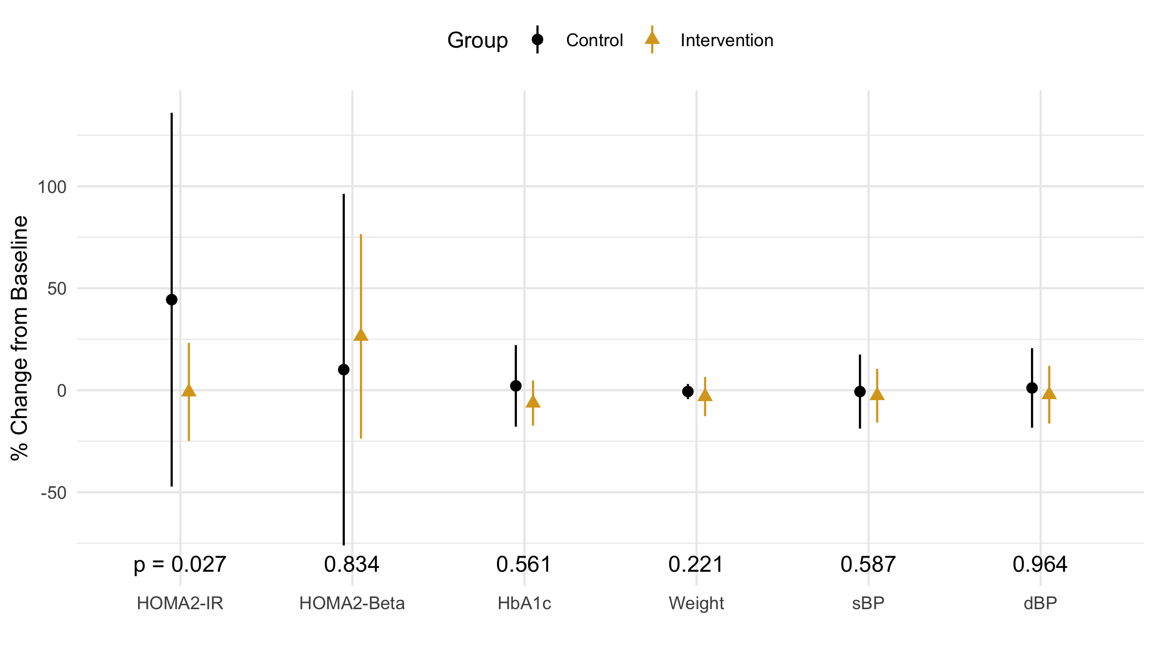
Figure 3 Distribution of the percent change in each primary and secondary outcome variable: the mean is marked by a point, and the verticle line marks one standard deviation.
The mean and standard deviation (SD) are not robust statistics; that is, they are highly influenced by outliers. The control group’s mean (Fig 3) is about 2x larger than the median (Fig 1). Similarly, the SD of the control group is about 4x larger than of the intervention group (Fig 3). When looking at the actual data in Fig 2, however, the spread while of the control group, while slightly larger, is primarily driven by the outlier: a single data point. Should we trust this point as valid? After all, an outlier in the wieght reported 38% weight loss in 15 weeks. It is time to get some domain knowledge.
After showing this outlier to our physician-PI (principle investigator), she said an HOMA-IR significantly less than 1.0 (see the first row of Table 2) is a sign of organ failure which is common in advanced stages of diabetes. Wow. This is the perfect reason to exclude outliers. People with organ failure should not be influencing our distribution!
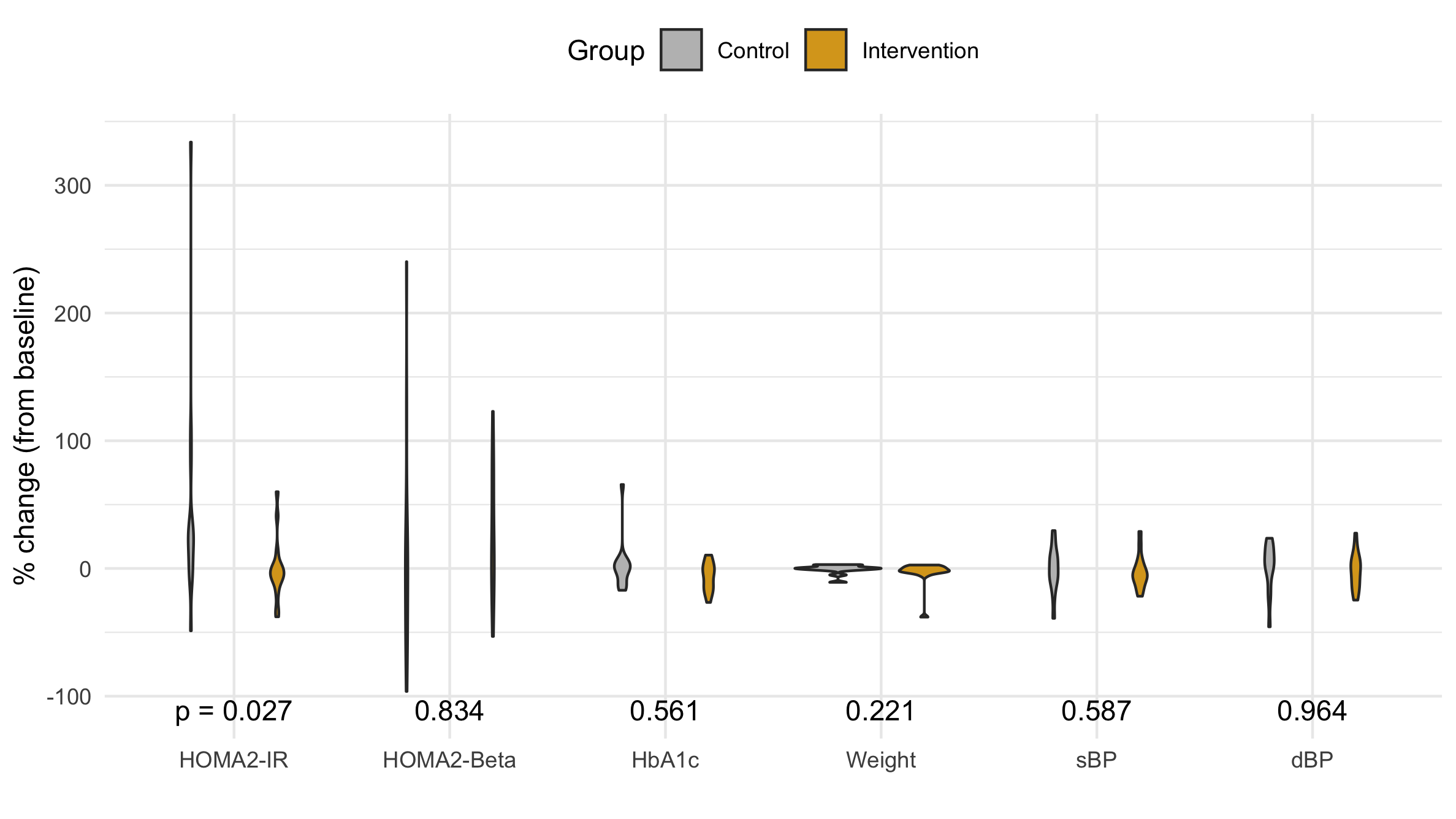
Figure 4 A violin plot of the distribution of the percent change in each primary and secondary outcome variable.
Since medical knowledge tells us to exclude outliers from our distrbution, the mean and SD are the wrong statistics.
Violin Plot
The violin plot shows the distribution's density as an horizontal displacement from the center. It usually does an great job comparing distributions; however, in this case the are such a range of distributions that the most disperse seem to have no width becoming a vertical line, and the most compact are nearly a horizontal line.
Box Plot
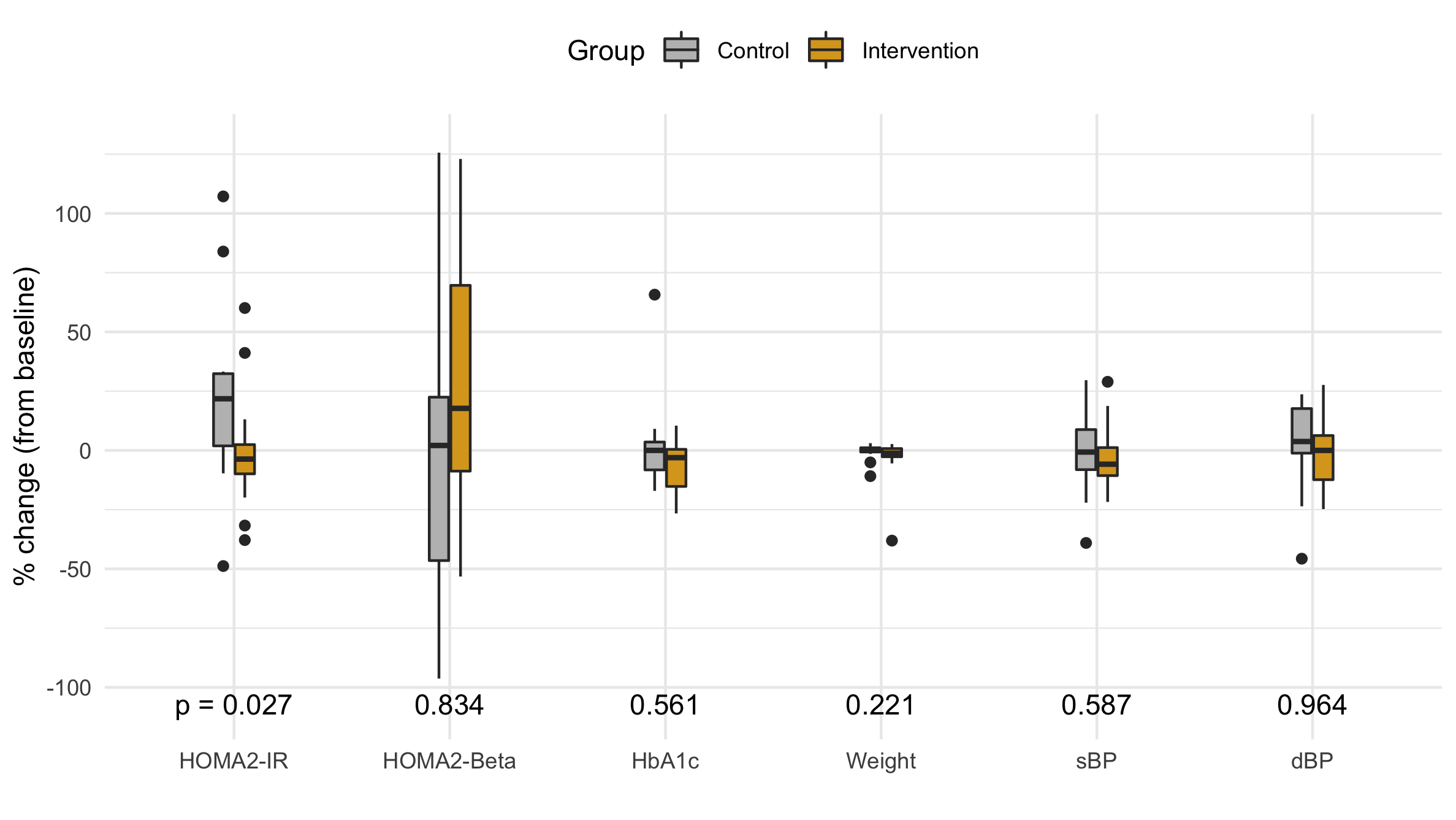
Figure 5 A box plot of the distribution of the percent change in each primary and secondary outcome variable.
While the violin plot is aesthetically appealing, it lacks a certain rigor. John Tukey pioneered the box plot which standardizes a distribution using quantiles (robust statistics). The box extends from the Q1 up to Q3 and has the median marked with a bold line. The height of the box is the interquartile range (IQR), and any skew is visible the upper and lower half of the box is a differnt size. Vertical bars extend up to either the distribution's edge or 1.5 IQR, and any points beyond 1.5 IQR are considered outliers and plotted individually.
Since our study is focusing on the main distribution, we choose to drop the outliers as a more succinct visualization that doesn't invite criticism of the outliers.
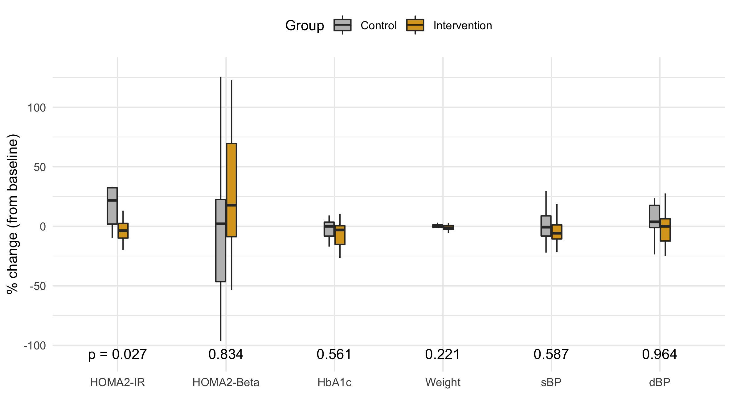
Figure 6 A box plot (without outliers) of the distribution of the percent change in each primary and secondary outcome variable.
Conclusion
One purpose of a visualization is to present a visual aggregate of the data. Each of the first three figures has some artifact (an artificial defect that doesn't match the original distribution). The artifact from the robust statistics (see Fig. 1) is a false skew that occured upon removing the outer half of the points from relatively small sample.
It seems that plotting the raw data would be the most honest, yet overplotting hides the true shape of the data. Jittering randomly displaces the x coordinate, but the randomness isn't uniform and often distorts or hides the distribution. Adding a translucence (not done) to each point is a method of revealing hidden points.
The artifact of the mean and SD in a distribution with outliers is a systematic bias skewing the mean and inflating the SD.
Adding a jitter and increasing the transluscence of each point will partially restore the misperception that occurs when viewing raw data.